

Welcome back to my round-up of Notes posts on Pynchon’s writing in anticipation of Shadow Ticket coming out Oct 7, 2025.
Essentially here I went all in on cover art. As of time of writing (May 19th) there is no book cover released for Shadow Ticket.
Catch up with my previous Pynchon dailies here.

Day 33 of new Pynchon novel,
Zachary Dillon yesterday commented on his interpretation of the Mason & Dixon first edition cover, which I found to be a very good interpretation, and I had already planned to mention my favorite covers, so there you go.
Against the Day 1st edition: like Mason & Dixon, this cover is minimalist while looking both distinct and holding references to the text. The title is written in three different fonts, two of them in progressive drop shadow, as if viewed through a piece of Icelandic spar, an optical effect mentioned often in the book and referencing branches of possible realities. A little international stamp on the lower left is broken, as if a secret missive that has been opened before delivered to you, and if I recall correctly the language on it is fake but it looks like famous diplomatic stamps of the 19th century.
I also have a personal fondness for it because it was the first time one of his books was newly published in the time that I knew about him, and I didn’t know it was coming so did a double-take and had to look closer. Was this really happening? The book still feels like a private hallucination of mine, it’s just wayyy too aligned with my interests.

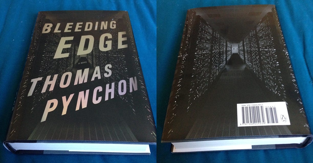
Bleeding Edge 1st edition cover: at first I didn’t like it. Looks like a cheap airport bookstore technothriller. But then someone pointed out that it The dark volumes on the left and right not only look like a server farm but also the Twin Towers. Oh. And I’m a sucker for holographic foil.
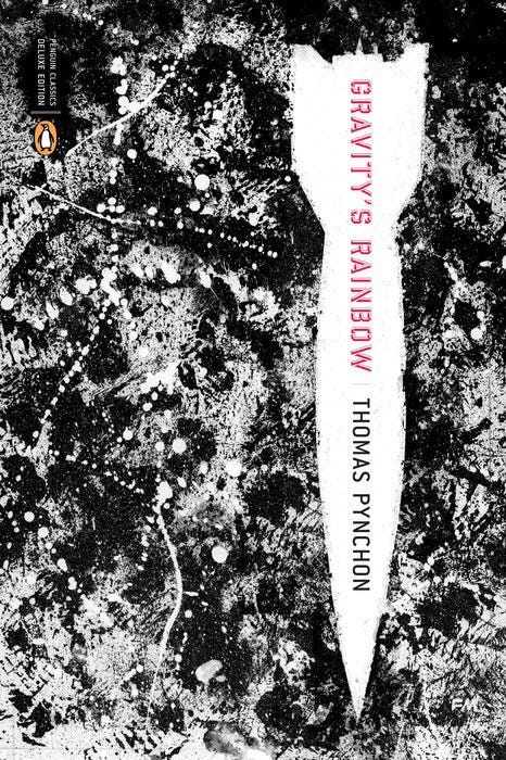
Gravity’s Rainbow, Penguin Classics Deluxe Edition: no smart reason for liking this one, I love glitch art, textural / stain / decay stuff, this one has sort of a look like an ink-smeared vintage printout of a bomb target landscape, it’s just pretty and cool.
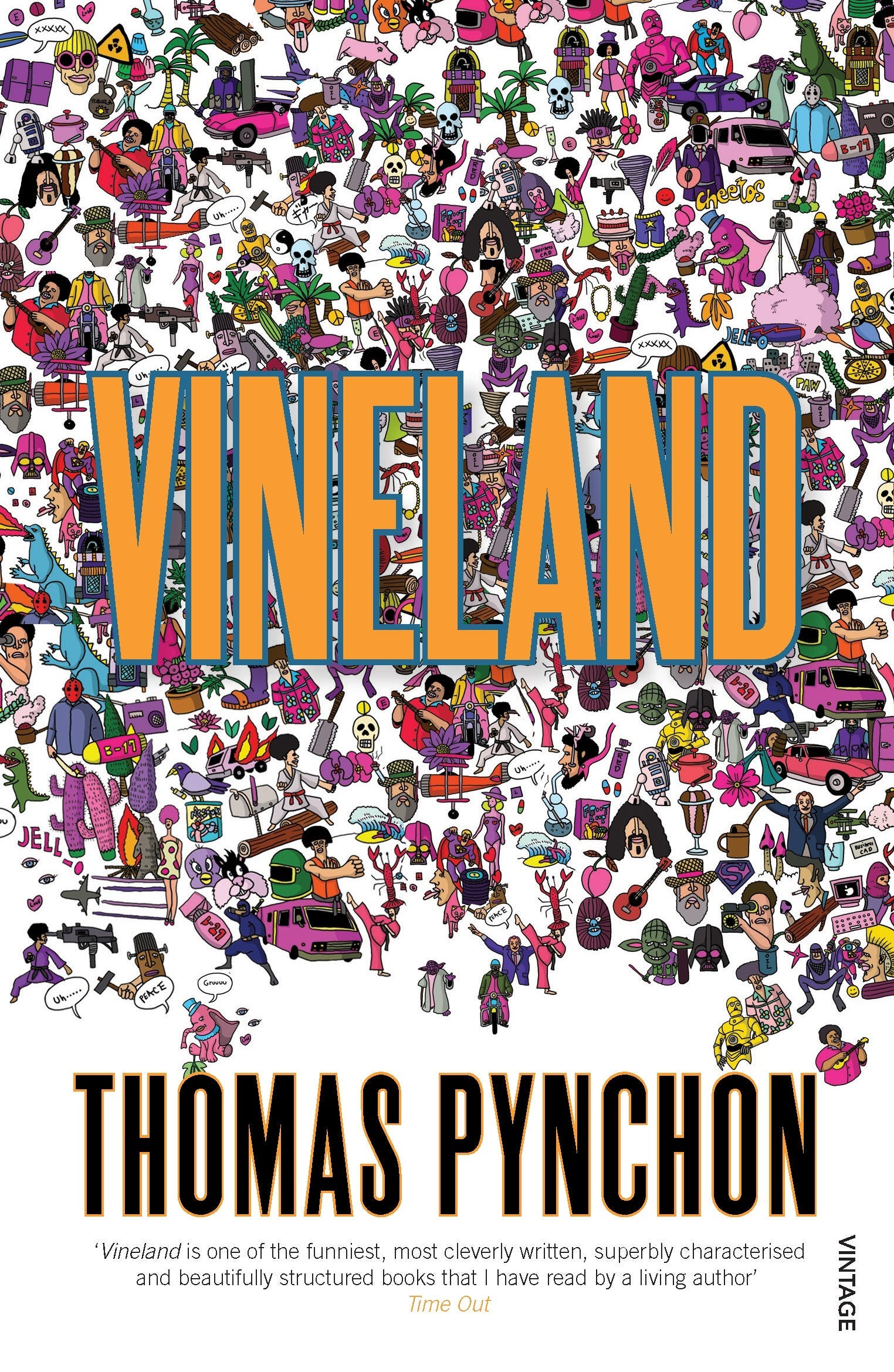
The Penguin Vintage editions: including Vineland here as an example but basically they’re all like this, same font and different drawings but each with a distinct leading color, these are the most playful and kaleidoscopic of his covers that give a visual business to match his prose. They covers are a little like comic books and I think his books would make great comic books, even more than I think they'd make good movies.
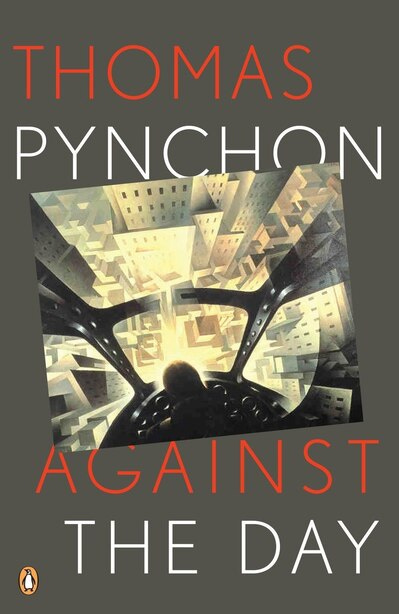
Against the Day Penguin trade paperback edition: A lot of Pynchon covers seem to refer to early modernist art movements to mixed success, but this one really gets me aesthetically because I love mazes, cubism, art deco, futurism, and there’s a bit of implied retrofuturism. The disappearing airship is an extremely smart visual and referential touch, the only thing I don't like about it is with the pilot facing down a seemingly art deco city makes it Gravity’s Rainbow coded.
Keep reading with a 7-day free trial
Subscribe to Indulging a Second Look to keep reading this post and get 7 days of free access to the full post archives.